

 Flat 4


Mekko Chart in PowerPoint: Step-by-Step Guide (2026)
A mekko chart (or marimekko chart) uses variable column widths to show the size of each category, and stacked segments inside each column to show its internal split. PowerPoint has no built-in type for this — you build one manually with shapes and guide lines, adapt a stacked bar chart, or generate it faster with a charting add-in.
Introduction
If you need to explain market segments in PowerPoint, a chart like this does more than a simple bar chart — it shows category size and internal structure in one view, which is why it works well for strategy, sales, and portfolio slides.
This guide covers how to create a mekko chart step by step: how the format works, how to prepare your data, and how to build and customize it in PowerPoint from there. If you’re looking for a PowerPoint mekko chart option specifically, know upfront that there’s no native chart type for it — you build the effect with shapes, adapt a native chart, or speed things up with an add-in.
Understanding Mekko Charts in PowerPoint
What Is a Mekko Chart?
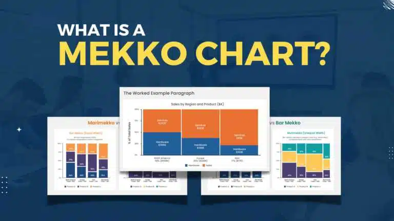
A mekko chart — also called a marimekko chart, mosaic plot, or percent stacked bar plot — is an area-based chart where column width shows the total size of each category and the height of each stacked segment shows that category’s internal share, so every block’s area combines size and share into a single number.
The name comes from Marimekko, the Finnish design house known for its bold, rectangular fabric prints — the chart’s blocky grid resembles that pattern, which is where the name stuck.
Some people search for this as a marimekko chart PowerPoint layout instead — both terms describe the same visual. The style is also often associated with McKinsey: a McKinsey mekko chart is a common way consulting teams show market structure and share together in one slide. That’s what sets this format apart from most PowerPoint charts, which usually show only one dimension clearly.
How It Differs From Other PowerPoint Charts
A standard column chart gives every category equal width and compares height only. This format changes that by making width represent size and height represent share, so each block carries combined meaning rather than a single value — which also means it takes more manual setup and upkeep than a standard native chart.
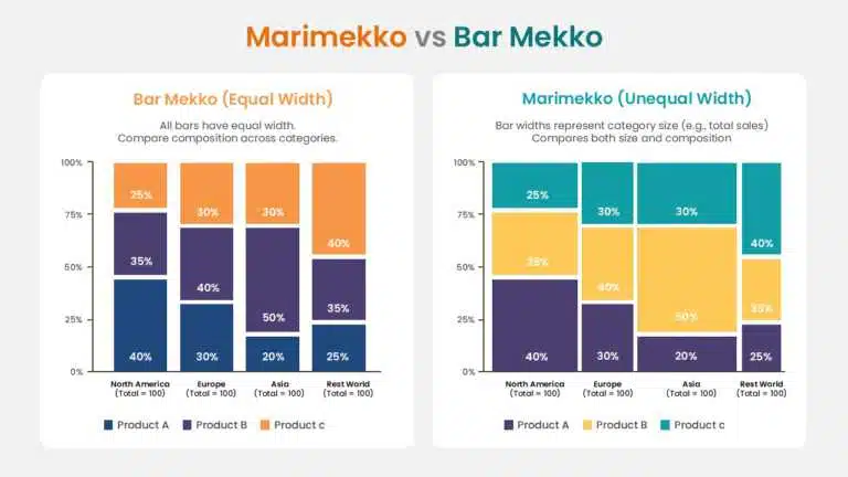
This is different from a bar mekko chart, which is its own chart type rather than a hand-stretched approximation of this one. A standard marimekko keeps every column at the same 100% height and varies only the width; a bar mekko varies both height and width, with height reflecting one measure (like margin) and width reflecting another (like sales), so the two shouldn’t be used interchangeably.
Marimekko vs. Bar Mekko, at a Glance
| Chart type | Column height | Column width |
| Marimekko | Always 100% — shows % share | Varies by category size |
| Bar Mekko | Varies — a separate numeric measure | Varies — a separate numeric measure |
Marimekko vs. Treemap
PowerPoint does include a native Treemap chart (Insert > Chart > Treemap), and it’s often confused with a mekko chart because both use rectangle area to show size. The difference: a treemap nests rectangles to show hierarchy and proportion only, with no consistent axis — it can’t show two independent dimensions the way a mekko chart’s width-and-height structure can. If you just need to show relative size within a hierarchy, PowerPoint’s built-in Treemap may be enough, and it saves you the manual build entirely.
Data That Works Best for a Mekko Chart
This format is a strong fit when you need to show both size and structure — think market segments with different total sizes, category breakdowns with a clear internal share, or business views where size affects importance, like product groups, regions, or business units.
Common mekko chart examples include a product line split by tier, regional revenue split by channel, or a portfolio split by business unit.
Why Use a Mekko Chart
Key Benefits
- Shows category size and internal structure in a single slide
- Reduces the need for multiple separate charts
- Makes it easy to spot which areas matter most and where they sit inside the whole
- Strong fit for strategy, revenue, portfolio, and competitive analysis slides
When It Beats a Standard Chart
It tends to outperform a standard chart in market analysis with uneven category sizes, portfolio comparisons across business units, and revenue structures where category size changes what a share actually means.
When Not to Use a Mekko Chart
People compare heights more accurately and quickly than they compare areas, so a mekko chart is easy to misread and a poor choice when a reader needs to make a precise comparison between two specific categories. For very simple updates, small datasets, or a slide where only one dimension matters, a standard bar or column chart communicates faster and is less likely to be misread. If you are still deciding which format fits your data, our guide to the different types of charts compares the main options side by side.
Preparing Your Data
Get your numbers right before opening PowerPoint — widths, heights, and areas all come from the source data, so errors here will distort the chart.
Steps to Organize Your Data
- Define your categories and each category’s total
- List the segments inside each category
- Decide whether internal splits are shown as percentages or absolute values
- Calculate the required width of each category: category total ÷ grand total of all categories × 100
- Confirm segment values add up to the category total (or 100%)
Example structure:
| Category | Total Size | Segment | Segment Share | Required Width |
| Product A | 40 | Premium | 50% | 40% (40 ÷ 100) |
| Product A | 40 | Standard | 50% | 40% (40 ÷ 100) |
| Product B | 35 | Premium | 30% | 35% (35 ÷ 100) |
| Product B | 35 | Standard | 70% | 35% (35 ÷ 100) |
| Product C | 25 | Standard | 100% | 25% (25 ÷ 100) |
Note: required width = category total ÷ grand total of all categories × 100. Here the three category totals (40 + 35 + 25) happen to sum to 100, which is why the totals and widths line up 1:1. If your totals sum to 250 instead, divide each category total by 250, not by 100.
Worked Example
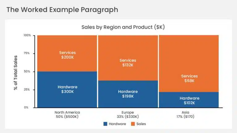
Say a company’s revenue splits across three regions, totalling $120M: North America ($60M — 70% hardware / 30% services), Europe ($40M — 55% hardware / 45% services), and Asia-Pacific ($20M — 80% hardware / 20% services). Each region’s column width is its share of the $120M total — North America 50% (60 ÷ 120), Europe 33% (40 ÷ 120), Asia-Pacific 17% (20 ÷ 120) — and each column’s internal segments are its hardware/services split. Reading the chart, you’d see immediately that North America is both the largest region and the most hardware-heavy, while Europe is more balanced.
Formatting Tips
- Keep category names short enough to fit as labels
- Make sure each category total matches its segment breakdown
- Use consistent percentage or value logic across the whole dataset
Mistakes to Avoid
- Category widths that don’t reflect the true totals
- Segment shares inside a category that don’t add up correctly
- Inconsistent label or value formatting
- Too many segments crammed onto one slide
Building a Mekko Chart in PowerPoint, Step by Step
Option 1: Build It Natively With Shapes (No Add-ins)
This gives you the most precise control over column widths, and it’s the method most consultants use for client-ready slides. For a similarly manual, shape-based build, see our guide on how to make a heat map in PowerPoint.
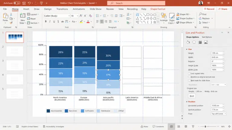
- Calculate category widths and segment heights from your prepared data
- Go to Insert > Shapes > Rectangle in PowerPoint
- Draw one rectangle per segment, then right-click and use Size and Position to enter exact width and height rather than dragging
- Use guide lines (View > Guides) or a table-based grid to align every rectangle without gaps
- Color-code segments consistently across categories
- Add labels — use separate text boxes for small segments where labels won’t fit inside the shape
- Select everything and press Ctrl+G to group the finished chart into one object
- Check the finished layout against your data table for accuracy
This method works well for a simple, one-off build. It’s slower to update later, since every change means resizing shapes by hand.
Option 2: Use a Stacked Bar Chart With Spacer Series
If you’d rather keep a native, editable chart object instead of loose shapes, you can build a true variable-width mekko using a Stacked Bar chart with invisible spacer series. The key idea is that the column widths are carried by the data values themselves — you never drag a column wider, because column thickness in a native chart is a series-level setting, not something you can change one column at a time.
Prepare the numbers first:
- Set your total chart width to 100 units
- Each category’s width = its share of the grand total. A region at 45% of revenue gets a column of 45 units
- Each segment’s value = segment share × column width. Enterprise at 40% of a 45-unit column = 18
- Add a spacer series between each real category to push the following column into position
Then build the chart:
- Insert > Chart > Bar > Stacked Bar — not 100% Stacked Bar, because your pre-calculated values already carry the proportions
- Enter your data including the spacer columns
- Right-click any bar > Format Data Series and set Gap Width to 0% — this is what makes the columns touch, which is the visual signature of a mekko chart
- Right-click each spacer series > Format Data Series > set Fill to No fill and Border to No line so the spacers disappear
- Apply your segment colors, then right-click > Add Data Labels and show percentages
This keeps the chart editable as a native PowerPoint object, so updating the data updates the chart. The trade-off is that the width calculations live in your data table rather than the chart, so re-check them whenever the underlying numbers change.
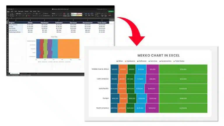
Option 3: Build in Excel, Then Paste into PowerPoint
If your team already works in Excel, build the same stacked-bar-plus-spacer structure there — it’s easier to audit the width calculations next to the source data, and Excel’s formula bar means you can recalculate segment values automatically when the inputs change. Then copy the finished chart into PowerPoint. Use Home > Paste dropdown > Paste Special > Paste Link to keep it connected to the Excel file, or paste as a picture if you want a static image that won’t shift.
Note that Excel has no native Marimekko type either — the Treemap added in Excel 2016 is a related but different chart, as covered above.
Option 4: Use a Charting Add-in
Several PowerPoint add-ins can generate a mekko chart directly from your data, which saves the manual work above. If you build these charts often, it’s worth comparing a few rather than defaulting to the first one you find:
- think-cell — widely used in consulting; separates ‘value’ and ‘percent’ axis Mekko types explicitly
- Mekko Graphics — built specifically around Marimekko and Bar Mekko chart types
- empower — general PowerPoint productivity add-in that includes chart automation
- Zebra BI — geared toward business-reporting dashboards, including Mekko-style visuals
Pricing, licensing, and feature sets change, so check current details with each vendor before standardizing a team on one. If you only need a chart occasionally, it’s worth weighing that cost against an AI presentation maker or one of the native build methods above.
If Your Add-in Isn’t Working
- Check File > Options > Add-ins to confirm it’s installed and enabled
- Restart PowerPoint after installing or re-enabling it
- If it still won’t load, fall back to one of the native methods above — the underlying logic is the same either way
Customizing a Mekko Chart
Colors, Labels, and Style
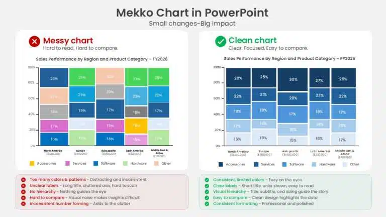
- Use the same color for the same segment across every category, so patterns are easy to scan
- Keep labels short; move labels for small segments into nearby text boxes instead of forcing them inside tiny shapes
- Favor clean, simple styling — heavy formatting competes with the data instead of supporting it — see our guide to PowerPoint color palettes for pairings that hold up across many segments
Mekko Chart Templates and Resources
PowerPoint has no native template for this — you’re working from shapes, a native chart, or an add-in. For a faster starting point, browse SlideUpLift’s chart and graph PowerPoint templates. Whatever the source, a template doesn’t replace a data check, so confirm widths, heights, and labels regardless of where the base file came from.
Conclusion
A well-built mekko chart in PowerPoint can say more in one slide than several standard charts combined — it shows category size and internal structure together, which makes market segments and business scenarios easier to grasp at a glance. Prepare your data carefully, choose the build method that fits how often you’ll use it, and keep the design clean so the structure stays easy to read.
FAQs
-
Can I make a Mekko chart in PowerPoint without an add-in?
Yes. Build it natively using rectangles, text boxes, and guide lines from Insert > Shapes, or use a Stacked Bar chart with invisible spacer series. PowerPoint has no built-in chart type for this, so either route takes more manual setup than a standard chart, but both work well for a one-off build.
-
What's the difference between a Marimekko and a Bar Mekko chart?
A Marimekko keeps every column at the same 100% height and varies only the width, so height shows percentage share within each category. A Bar Mekko varies both height and width, with each dimension carrying a separate numeric measure — height might be margin and width might be sales. Use a Marimekko when you’re showing composition, and a Bar Mekko when both dimensions are absolute values.
-
What's the fastest way to build a Mekko chart if I make them often?
For frequent use, a charting add-in (think-cell, Mekko Graphics, empower, or Zebra BI) will generate the chart directly from your data and keep formatting consistent across a team — worth the setup cost if you’re building these regularly. Compare a couple before standardizing on one.
-
What are the most common Mekko chart mistakes?
Inaccurate category widths, segment shares that don’t add up, overcrowded labels, and inconsistent colors or fonts. Start with accurate data, then use guide lines to keep shapes aligned.
-
How do I customize colors and labels in a Mekko chart?
Select a shape and use Shape Fill to set its color; add or edit labels through a text box. Keep the same color per segment across categories, and keep labels short and readable.
-
Where can I find mekko chart PowerPoint templates?
Not natively in PowerPoint itself. Browse SlideUpLift’s chart and graph templates for a starting layout, or generate the chart directly from your data with an add-in.
Table Of Content



Related posts from the same category

14 Aug, 2026 | SlideUpLift
SlideUpLift Launches Creatos AI, the AI Presentation Maker That Never Starts From a Blank Page
Free to try, with 40,000+ professionally designed slides, AI-assisted editing, one-click branding and a fully editable PowerPoint at the end JERSEY CITY, N.J. - Aug. 14, 2026 : SlideUpLift, a

14 Aug, 2026 | SlideUpLift
How to Create an Impactful Career Presentation
Quick Answer: A strong career presentation has three parts: a short intro that states who you are and where you're headed, 3–5 milestones told as brief stories (not a list

30 Jul, 2026 | SlideUpLift
The Ultimate Guide to Types of Charts and Their Uses
Quick Answer: There are many types of charts to choose from, and there is no single "best" one — the right choice depends on what you want your data to
16 Jul, 2026 | SlideUpLift
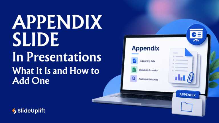
Appendix Slide in Presentations: What It Is and How to Add One
Appendix Slides: Additional data & Q&A for deeper insights An appendix slide is a supporting slide placed at the end of a presentation, after the closing slide, that holds supplementary

6 Jul, 2026 | SlideUpLift
Mastering Masking Images in PowerPoint: Step-by-Step Guide
Quick Answer Masking images in PowerPoint means displaying a picture only within a chosen shape — such as a circle, custom outline, or block of text — instead of a
15 Jun, 2026 | SlideUpLift
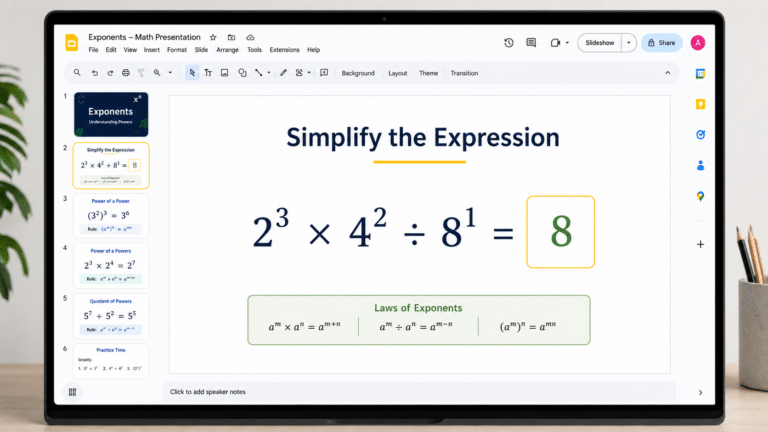
How to Add Exponents in Google Slides (3 Methods)
Quick Answer: To add an exponent in Google Slides: Click inside a text box and type your full equation (e.g., x2). Highlight only the character to raise (e.g., the '2').

3 Jun, 2026 | SlideUpLift
How to PowerPoint Shuffle Slides: 3 Easy Methods
Quick Answer PowerPoint has no built-in shuffle button, but you can randomize PowerPoint slides in three ways: Drag and drop in Slide Sorter view — fastest for small decks (under

26 May, 2026 | SlideUpLift
Claude for PowerPoint: A Comprehensive Guide for Users
Quick Answer Claude for PowerPoint is an official AI add-in by Anthropic, installed from the Microsoft Marketplace (AppSource). Once added, it embeds a sidebar directly in PowerPoint — on the

30 Apr, 2026 | SlideUpLift
How to Add a Border in Google Slides (7 Easy Methods)
To add a border in Google Slides, insert a rectangle shape, set its fill to transparent, and customize the border color and weight from the toolbar. You can apply borders

28 Apr, 2026 | SlideUpLift
How to Insert a PDF into Google Slides Every Method That Actually Works
No, Google Slides does not let you insert a PDF directly as an editable PDF object. Instead, you can use one of three practical workarounds. First, convert the PDF pages
24 Apr, 2026 | SlideUpLift
How to Insert a Check Mark in PowerPoint (PPT): 6 Methods
The fastest way to insert a check mark in PowerPoint is to copy and paste this symbol directly: ✓. If you want to insert it from PowerPoint, go to Insert

22 Apr, 2026 | SlideUpLift
How to make a Venn Diagram on Google Slides (3 Easy Methods)
Need to compare two products, contrast competing ideas, or map shared traits for a classroom exercise? The most common question designers and educators ask is how to make a Venn

21 Apr, 2026 | SlideUpLift
How To Lock An Image In Google Slides: Complete Step-By-Step Guide
If you have ever carefully positioned a logo or background graphic in Google Slides — only for an accidental click to send it flying across the slide — you are

15 Apr, 2026 | SlideUpLift
How To Change Opacity in Google Slides (Images, Shapes & Backgrounds)
In Google Slides, images and shapes use different controls for opacity. To change the opacity of an image, select it, open Format options, and adjust the Opacity or Transparency control

14 Apr, 2026 | SlideUpLift
How to Add a Video to Google Slides Step by Step (2026)
Embedding a video in your presentation takes just a few clicks through the Insert menu — but getting it to actually play for your audience requires knowing a few rules

13 Apr, 2026 | SlideUpLift
How To Lock An Image In PowerPoint: Complete Step-By-Step Guide
If you have ever spent time positioning a logo or background graphic perfectly — only for an accidental click to send it flying across the slide — this guide is

8 Apr, 2026 | SlideUpLift
How to Embed YouTube Video in PowerPoint (2026 Complete Guide)
Most PowerPoint videos fail at the worst moment — they don’t play, lag during playback, or force you to switch tabs mid-presentation. This guide shows you exactly how to embed
6 Apr, 2026 | SlideUpLift
How to Make an Interactive Quiz in PowerPoint (No Add-ins Required)
Quick Answer You can build a fully interactive quiz in PowerPoint using only the built-in Action and Hyperlink features — no add-ins or plugins required. Create three slide types (question,

1 Apr, 2026 | SlideUpLift
How to Print Google Slides with Notes: Step-by-Step Guide
Knowing how to print Google Slides with notes gives presenters and audiences a richer, more complete version of any presentation — each printed page shows the slide in the upper

30 Mar, 2026 | SlideUpLift
How to Convert PPT to Video: Complete Guide for 2026
This guide shows how to convert PPT to video using PowerPoint and other tools with simple, step-by-step methods. It covers formats, quality settings, narration, animations, and fixes for common export

26 Mar, 2026 | SlideUpLift
How to Curve Text in Google Slides (5 Methods That Actually Work)
This guide explains how to curve text in Google Slides using simple workarounds like Word Art, text rotation, and external tools, since there’s no built-in feature for curved text. It

24 Mar, 2026 | SlideUpLift
How to Wrap Text in Google Slides — 4 Methods That Actually Work
Learn how to wrap text in Google Slides with simple step-by-step methods to align text around images and create clean, professional layouts. This guide explains practical workarounds since Google Slides

20 Mar, 2026 | SlideUpLift
How to Add Annotations in PowerPoint: The Complete Step-by-Step Guide
This blog explains how to add real-time annotations in PowerPoint presentations using tools like the pen, highlighter, and laser pointer to make slides more interactive and engaging. It provides step-by-step

17 Mar, 2026 | SlideUpLift
How to Create a Project Presentation That Gets Stakeholder Approval
In any business environment, the ability to create a project presentation that actually moves people — securing approvals, aligning teams, and building client confidence — is one of the most
16 Mar, 2026 | SlideUpLift
How to Convert PowerPoint to Google Slides?
This blog explains how to convert PowerPoint to Google Slides using simple step-by-step methods like uploading PPT files to Google Drive or importing them directly into Slides. It helps users

13 Mar, 2026 | SlideUpLift
How to Play Video in PowerPoint Across Single and Multiple Slides
This blog explains how to play a single video across multiple slides in PowerPoint using simple animation and playback settings. It walks through the step-by-step process of inserting the video,

11 Mar, 2026 | SlideUpLift
How to Hide a Slide in Google Slides: Complete Guide
Learn how to hide and unhide slides in Google Slides without deleting them in this step-by-step guide. The blog explains simple methods like using the Skip Slide option, toolbar, and

9 Mar, 2026 | SlideUpLift
How to Hide and Unhide Slides in PowerPoint (Complete Guide)
This blog explains how to hide and unhide slides in Microsoft PowerPoint so you can skip certain slides during a presentation without deleting them. It covers why the hide slide

5 Mar, 2026 | SlideUpLift
Quarterly Business Review (QBR): What It Is, Examples & How to Present One
A QBR, or quarterly business review, is a strategic meeting held every three months to evaluate business performance, review key metrics, and align on goals for the next quarter. QBRs

4 Mar, 2026 | SlideUpLift
What Is a Product Roadmap? A Complete Guide With Types, Examples, and Templates
A product roadmap is a high-level strategic document that communicates a product’s vision, direction, priorities, and planned progress over time. It shows the product team and stakeholders what is being
![How To Broadcast a PowerPoint Presentation Online [6 Working Methods]](https://slideuplift.com/wp-content/uploads/2020/04/Broadcast-Presentation-Online-1.jpg "How To Broadcast a PowerPoint Presentation Online [6 Working Methods]")
27 Feb, 2026 | SlideUpLift
How To Broadcast a PowerPoint Presentation Online [6 Working Methods]
If you have been looking for a way to broadcast a PowerPoint presentation online to a remote audience, you have probably run into tutorials that tell you to click Slide
27 Feb, 2026 | SlideUpLift
How to Change Transparency in PowerPoint (Step-by-Step Guide)
Learn how to use transparency in Microsoft PowerPoint to adjust the opacity of images, shapes, and text for cleaner, more professional slide designs. This step-by-step guide explains how to change

24 Feb, 2026 | SlideUpLift
Which Program Is Used to Open PPTX Files: Complete Guide
This blog explains which program is used to open PPTX files and how to view or edit presentations on Windows, Mac, and mobile devices. It covers tools like Microsoft PowerPoint,

20 Feb, 2026 | SlideUpLift
How to Create Engaging Academic Presentations: 10 Expert Tips + Templates
This blog is a complete guide on how to create engaging academic presentations, offering 10 expert tips for structuring content, designing slides, and delivering with confidence. It covers common mistakes

20 Feb, 2026 | SlideUpLift
How to Make Google Slides Play Automatically On A Loop? (Step-by-Step Guide)
There are two main ways to make Google Slides play automatically on a loop, and the right method depends on how you are showing the presentation. For a live presentation,
18 Feb, 2026 | SlideUpLift
How to Copy a Slide in Google Slides: Step-by-Step Guide
Learn how to duplicate, copy, and paste a slide in Google Slides using simple, step-by-step methods. This guide covers desktop shortcuts, right-click options, toolbar methods, and mobile steps for Android

17 Feb, 2026 | SlideUpLift
How to Round Corners in Google Slides: Complete Guide
Learn how to round corners in Google Slides using both the simple yellow handle method and the advanced Edit Points feature. This guide explains how to adjust the corner radius,
12 Feb, 2026 | SlideUpLift
How To Add plus or minus symbol in PowerPoint Presentations – Step-by-Step Guide
This blog explains how to add the plus or minus symbol (±) in Microsoft PowerPoint using keyboard shortcuts (Windows & Mac), the Symbols menu, equation tools, and copy-paste methods. It
10 Feb, 2026 | SlideUpLift
How To Convert Google Slides Into PDF: Quick & Easy Guide
This guide explains how to convert Google Slides into a PDF quickly and without formatting issues. It covers saving slides with or without speaker notes and methods for desktop and

6 Feb, 2026 | SlideUpLift
How To Make A Professional PowerPoint Presentation With Practical Tips
This blog shows how to make professional presentations with clear structure, engaging visuals, and effective delivery. It highlights using AI tools like ChatGPT and Copilot with ready-made templates to quickly

4 Feb, 2026 | SlideUpLift
How to Write a Sales Pitch That Captures Attention and Converts Leads
This SlideUpLift guide explains how to write an effective sales pitch by identifying your target audience, highlighting your unique value, focusing on benefits over features, and structuring a persuasive presentation

30 Jan, 2026 | SlideUpLift
Sales Presentation: A Complete Guide to Structure, Examples, and Best Practices
This blog is a complete guide to building a high-impact sales presentation, covering everything from structure and slide selection to delivery and follow-up. It explains what makes sales presentations effective,
28 Jan, 2026 | SlideUpLift
Types of Slides That Make Presentations Clear, Engaging, and Impactful
This blog explains why choosing the right slide types is essential for clear, engaging presentations. It covers the most important PowerPoint slide types, when to use them, and how they
23 Jan, 2026 | SlideUpLift
How to Rotate a Slide in PowerPoint: Complete Guide
This blog explains how to rotate slides in PowerPoint using all practical methods, including changing slide orientation, rotating objects, and handling single-slide workarounds. It also covers professional solutions for mixing
21 Jan, 2026 | SlideUpLift
What Is 6×6 Rule in PowerPoint? Complete Guide To Improve Slides
This blog explains what is 6x6 Rule in PowerPoint and how it improves slide clarity and readability. It shows how to apply the rule, avoid common mistakes, and compare it
19 Jan, 2026 | SlideUpLift
How to Add Footnotes in PowerPoint: A Step-by-Step Guide
Adding footnotes in PowerPoint helps you cite sources and add context without overcrowding your slides. Since PowerPoint doesn’t offer an automatic footnote feature, footnotes are created manually using text boxes

16 Jan, 2026 | SlideUpLift
How To Merge PowerPoint Presentations Using Simple Methods and a Free Tool
Learn how to merge PowerPoint presentations quickly and easily using manual methods or a free merge PPT tool. Keep slides, formatting, animations, and transitions intact while creating polished, professional decks.

14 Jan, 2026 | SlideUpLift
McKinsey Slide Deck Guide: Presentation Style, Real Examples and Templates (2026)
The McKinsey presentation style is a structured, minimalist approach designed to help executives understand the main conclusion quickly. A typical McKinsey-style deck uses one clear idea per slide, an answer-first

14 Jan, 2026 | SlideUpLift
How to Add a Timer to Google Slides: Step-by-Step Guide
This blog walks you through how to add a timer to Google Slides using simple, practical methods that actually work. It covers Auto-play timing, visible countdown timers, videos, and add-ons,

8 Jan, 2026 | SlideUpLift
How to Prepare for a Presentation: A Simple Guide for Beginners
This blog explains how to prepare for a presentation step by step. It covers goal setting, content structuring, slide design, practice, and handling questions. Beginners can also learn common challenges,

6 Jan, 2026 | SlideUpLift
Presentation Tips for Structuring Messages and Effective Storytelling
This blog breaks down practical presentation tips to help you plan, design, and deliver slides that truly stand out. It covers how to simplify text, use visuals effectively, and maintain

12 Dec, 2025 | SlideUpLift
18 Best Google Slides Themes for Business & Corporate Presentations
The best Google Slides themes for business are editable, professionally designed decks built around a specific presentation job - a proposal, a QBR, a strategy roadmap, or an investor update.

9 Dec, 2025 | SlideUpLift
How to Change a PowerPoint Template – Quick Step-by-Step Guide
To change a PowerPoint template without rebuilding your presentation, open the Design tab, click the More arrow in the Themes group, choose Browse for Themes, and select the saved theme

4 Dec, 2025 | SlideUpLift
The 5-5-5-Rule-of-PowerPoint: Your Guide to Effective Design
The 5-5-5 rule of PowerPoint is a simple guideline for keeping presentation slides readable: use no more than 5 words per line, 5 lines of text per slide, and avoid

12 Nov, 2025 | SlideUpLift
How to Create a Heat Map in PowerPoint: Beginner-Friendly Guide
Heat maps are one of the easiest ways to turn rows of numbers into visuals people understand quickly. In this blog, you will learn what a heat map is, in

6 Nov, 2025 | SlideUpLift
How to Add Transitions in PowerPoint: Complete Step-by-Step Guide
Do you want to create a seamless flow in your PowerPoint slides and make a strong impression? While adding transitions to PowerPoint slides might seem obvious, transitions are the key

4 Nov, 2025 | SlideUpLift
How to Use Morph in PowerPoint: The Ultimate Guide to Smooth Transitions
If you’ve ever watched a presentation where shapes flow smoothly, images glide effortlessly, and text elegantly shifts between slides, you’ve witnessed the power of Morph in PowerPoint. This feature is
30 Oct, 2025 | SlideUpLift
How To Make A Graph In PowerPoint: Step-by-Step Guide
The goal of impactful graphs is not simply to convey data; rather, it is to tell a story with data that has meaning to the audience. Graphs and charts can

13 Oct, 2025 | SlideUpLift
How to Write a Business Case: A Beginner’s Guide + Examples
Every project needs a passport to get through executive approval. Without it, even the best plans can get grounded before taking off. This very piece of evidence holds the power

10 Oct, 2025 | SlideUpLift
What Is A Project Charter? Definition, Examples & Best Practices
Launching a project without adequate planning can result in confusion, delays, and misaligned expectations. A project charter is a key document in the project documentation process that lays the groundwork

8 Oct, 2025 | SlideUpLift
How to Insert Emoji in Google Slides & PowerPoint for Fun, Eye-Catching Slides
Have you ever thought about how a simple emoji can change the mood or tone of your presentation? You could use a smiley face 😊, that would certainly lighten the

1 Oct, 2025 | SlideUpLift
Insert Calendar In PowerPoint And Google Slides: Quick Guide For Smarter Planning.
Do you want your presentations to be more organized, attractive, and professional? Learning how to add a calendar in PowerPoint or Google Slides will take boring schedules and deadlines and
26 Sep, 2025 | SlideUpLift
What Is a PPTX File? Think of It as PowerPoint 2.0
A .pptx file is Microsoft PowerPoint's Open XML presentation format, introduced with PowerPoint 2007 as the successor to the older binary .ppt format. It can contain slides, text, images, charts,

17 Sep, 2025 | SlideUpLift
Google Slides Strikethrough: Cross Out The Old And Spotlight The New
Ever wished you could just cross something out instead of deleting it? You know, like putting a big line through “boring idea” and replacing it with “brilliant plan”. That’s the
12 Sep, 2025 | SlideUpLift
What is KPI? Step-by-Step Guide with KPIs Examples That Work
Is it hard for you to know if your business is getting to the level it should be? That's where key performance indicators (KPIs) come into play. KPIs indicate how

10 Sep, 2025 | SlideUpLift
Best Fonts For PowerPoint Presentation: The Runway Of Letters
Imagine this: your presentation is a red-carpet event. Your slides are the guests, the content is the message, and the font? That is the outfit; the one builds up the

10 Sep, 2025 | SlideUpLift
Advantages and Disadvantages of Microsoft PowerPoint: Pros, Cons, and AI Features Explained
PowerPoint has been the go-to tool for presentations for decades—but is it keeping up with today’s fast-paced, AI-driven world? PowerPoint makes it easy to take ideas to slides, whether you're

5 Sep, 2025 | SlideUpLift
10 Virtual Meeting Etiquette Rules for Professionals
Introduction Virtual meetings and online meetings are the new normal for remote work teams everywhere. Whether you're chatting with co-workers, giving a client presentation, or taking part in a hybrid

3 Sep, 2025 | SlideUpLift
How to Add Watermark in PPT Like a Pro: Step-by-Step Tutorial
Every presentation tells a story, but it should also say who it belongs to, right? And if we tell you that there is a way to stamp your identity on

29 Aug, 2025 | SlideUpLift
50 ChatGPT Prompts for Presentations (Copy-Paste Ready, Categorized for Professionals)
Most professionals don’t have a ChatGPT problem. They have a prompt problem. If you’ve ever asked ChatGPT to “make me a presentation on quarterly sales” and watched it spit out

29 Aug, 2025 | SlideUpLift
Microsoft Copilot vs ChatGPT-4 Showdown: Who’s Got the Edge?
Not long ago, making a presentation meant spending hours and hours writing content, formatting slides, finding visuals, and tweaking layouts. Tools like PowerPoint and Google Slides gave us templates, but

29 Aug, 2025 | SlideUpLift
14 Best Presentation Software Tools in 2026: In-Depth Comparison Guide
The fact is, giving a great presentation is not only about how you choose your words, but rather involves expressing those very words. With the right PowerPoint presentation software, you

28 Aug, 2025 | SlideUpLift
Password Protect PPT: How To Secure Your Presentations (Easy Guide)
Have you ever shared a PowerPoint and then worried, “What if someone changes my slides?”, or even worse, “What if the wrong person opens it and leaks the content?”. Frustrating,

26 Aug, 2025 | SlideUpLift
Track Changes In PowerPoint And Keep Your Team In Sync
Ever spent hours perfecting a PowerPoint, way too much time that you then forget to track who made what change? You aren't alone. Unfortunately, unlike Word or Gmail slides, PowerPoint
14 Aug, 2025 | SlideUpLift
Curved Arrow PowerPoint: How to Make, Draw, and Customise Arrows Step by Step
Quick Answer: To make a curved arrow in PowerPoint, go to Insert > Shapes > Block Arrows, select a curved arrow shape, and drag to draw it on your slide.

13 Aug, 2025 | SlideUpLift
How To Create Infographics In PowerPoint For Smarter Visual Storytelling?
As a professional, you might have to host meetings and deliver presentations to your stakeholders and team members. As a host, it's crucial to deliver presentations in a way that

6 Aug, 2025 | SlideUpLift
How To Edit Footer In PowerPoint For Consistent Presentation Design
Footers are an important part of a PowerPoint presentation. They give the same footer text, like the date or slide numbers, on all slides. This helps people understand the talk

31 Jul, 2025 | SlideUpLift
Google Slides vs PowerPoint: A Complete Comparison Guide
Introduction Stuck deciding between Google Slides and PowerPoint for your next big presentation? Yeah, we've been there too. Both pack a punch with features, leaving you wondering: "Which one will

25 Jul, 2025 | SlideUpLift
How Many Slides For A 30 Minute Presentation? Timing, Tips, and Structure
One of the biggest challenges in presentations is staying on time. Whether it’s 5 minutes or 45, running over means rushing key points or losing your audience. Here’s the good

21 Jul, 2025 | SlideUpLift
PowerPoint Slide Size 101: Why It Matters More Than You Think
The default PowerPoint slide size is Widescreen (16:9), which measures 13.33 x 7.5 inches and is commonly used at 1920 x 1080 px for Full HD screens. The older Standard

15 Jul, 2025 | SlideUpLift
Google Slides Shortcuts Cheat Sheet To Boost Workflow
Google Slides is already a go-to tool for everything. From classroom projects to business decks and online workshops. It is a one-stop platform to create and share your ideas, thoughts,

7 Jul, 2025 | SlideUpLift
PowerPoint Shortcuts: The Beginner-to-Pro Keyboard Cheat Sheet
PowerPoint is one of the most powerful tools for creating presentations. However, working in PowerPoint can become time-consuming, especially when you have to click through menus for every small task.

4 Jul, 2025 | SlideUpLift
Why Your Conclusion Slide Matters—And How To Get It Right
Picture this: You've delivered an amazing presentation. Great start solid middle... but then... the ending just... flops. The energy drains. People shuffle out, already thinking about lunch. Sad, isn't it?
3 Jul, 2025 | SlideUpLift
How to Change Text Color in Google Slides for Maximum Impact – Quick Guide
Using Google Slides to build presentations is now widely practiced across the digital world. It is clean, collaborative, and performs its tasks fairly well. Be it a business pitch, a

30 Jun, 2025 | SlideUpLift
A Simple Guide On How To Change Margins In PowerPoint
Margins—those often-overlooked borders framing your slides—play a crucial role in creating polished, professional presentations. Adjusting margins helps you control your layout. This is important for printed handouts and projections. It
![How to Make an Org Chart in PowerPoint: Step-by-Step Guide [+ Templates]](https://slideuplift.com/wp-content/uploads/2021/01/How-to-create-an-org-chart-in-powerpoint.jpg "How to Make an Org Chart in PowerPoint: Step-by-Step Guide [+ Templates]")
13 Jun, 2025 | SlideUpLift
How to Make an Org Chart in PowerPoint: Step-by-Step Guide [+ Templates]
Without a clear org chart, even small teams feel messy. People start asking: “Who’s responsible for what?” Whether you are a manager, HR professional, or team lead, explaining the team

12 Jun, 2025 | SlideUpLift
How to Make an Org Chart in Google Slides: A Step-by-Step Guide
Want to map out any type of organizational structure—whether it's a company, project team, or even a hierarchy? An org chart helps visualize relationships between roles, departments, or functions in

28 May, 2025 | SlideUpLift
Beginner’s Guide: How To Make A Venn Diagram In Powerpoint
What Is A Venn Diagram? In today’s fast-paced business world, clarity is currency, and Venn diagrams deliver just that. Whether you're analyzing market segments, comparing competitors, or aligning team strategies,

27 May, 2025 | SlideUpLift
How to Create a Roadmap Diagram in PowerPoint? (Step-by-Step Guide)
Need to build a professional roadmap slide for your next presentation? You are in the right place. This tutorial walks you through every method for creating a roadmap diagram in

14 May, 2025 | SlideUpLift
How To Crop A Picture Into A Circle In The Presentation: Step-By-Step Guide
To crop a picture into a circle in PowerPoint, select the image, go to Picture Format -> Crop -> Crop to Shape, and choose Oval. Then use a 1:1 aspect

9 May, 2025 | SlideUpLift
Mastering SVG in PowerPoint for Sharp & Professional Slides
SVG vs PNG in PowerPoint SVG in PowerPoint refers to inserting Scalable Vector Graphics — images built from mathematical paths instead of pixels — directly into your slides. Because SVGs

6 May, 2025 | SlideUpLift
VBA in PowerPoint: How to Automate Your Slides
Quick answer: VBA (Visual Basic for Applications) is the programming language built into PowerPoint. You use it to write macros that automate repetitive tasks — formatting every slide, inserting logos,

2 May, 2025 | SlideUpLift
150+ Informative Speech Topics for 2026 (Students, College & Work)
Picking the right informative speech topic is half the battle: it decides how easy your research will be, how confident you'll sound, and whether your audience leans in or checks
22 Apr, 2025 | SlideUpLift
18 Timeline Examples for Presentations (+ Free Templates)
Quick answer: A timeline is a visual that shows events in chronological order, making milestones, schedules, and progress easy to follow at a glance. Presenters use them for project plans,

28 Mar, 2025 | SlideUpLift
Can ChatGPT Make a PowerPoint Presentation? Step-by-Step Guide
Yes, ChatGPT can help you make a presentation by generating the outline, slide-by-slide content, key messages, and speaker notes. It can also produce a basic downloadable PowerPoint file through supported
![How to Present an Action Plan in PowerPoint: Templates, Design Tips & Examples [2026]](https://slideuplift.com/wp-content/uploads/2024/12/Blog-Header-Image_How-To-Present-An-Action-Plan_Dec24-1-1.jpg "How to Present an Action Plan in PowerPoint: Templates, Design Tips & Examples [2026]")
2 Jan, 2025 | SlideUpLift
How to Present an Action Plan in PowerPoint: Templates, Design Tips & Examples [2026]
Why Presentation Matters You’ve created a solid action plan. Now comes the critical part: presenting it effectively to stakeholders, team members, and leadership. Here’s the reality: A brilliant action plan
![How to Write an Action Plan: 5-Step Guide with Examples [2026]](https://slideuplift.com/wp-content/uploads/2024/12/Header-Images-Blog-1.jpg "How to Write an Action Plan: 5-Step Guide with Examples [2026]")
2 Jan, 2025 | SlideUpLift
How to Write an Action Plan: 5-Step Guide with Examples [2026]
What Is An Action Plan? An action plan is a detailed roadmap that transforms your goals into concrete, executable steps. It’s not just a wish list—it’s a strategic document that

10 Dec, 2024 | SlideUpLift
How to Make a PowerPoint Presentation Attractive: 11 Design Techniques (2026)
Quick Answer: Making a PowerPoint attractive comes down to a set of repeatable layout techniques — visual bullets, split layouts, chunking, full-bleed images with overlays, icon systems, focal points, and

22 Nov, 2024 | SlideUpLift
Personal Timeline Examples: 15+ Ideas to Map Your Life Story
A personal timeline is a visual map of the key moments in your life — births, milestones, achievements, and turning points — arranged in chronological order. People use them for
![Org Chart Examples: 12 Real Examples by Type & Industry [+ Free Templates]](https://slideuplift.com/wp-content/uploads/2024/08/COVER-PAGE_12-Org-Chart-Examples-You-Need-To-Check-Out-Templates_JULY26.jpg "Org Chart Examples: 12 Real Examples by Type & Industry [+ Free Templates]")
5 Aug, 2024 | SlideUpLift
Org Chart Examples: 12 Real Examples by Type & Industry [+ Free Templates]
An organizational chart (org chart) is a diagram that shows a company's internal structure — who reports to whom, how teams are grouped, and where each role sits in the

24 Jul, 2024 | SlideUpLift
SWOT Analysis: The Complete Guide to Strengths, Weaknesses, Opportunities & Threats
One of the biggest challenges professionals face is a lack of structured thinking when strategizing plans, conducting competitor analysis, or evaluating current strategies. This often leads to wasted time, inconsistent

25 Jun, 2024 | SlideUpLift
Best PowerPoint Color Palettes for 2026 (Trends, Examples & Psychology)
The best PowerPoint color palette depends on the purpose and tone of your presentation. For corporate decks, use dependable blues, teals, whites, and neutrals to create a clear, credible look.

24 Apr, 2024 | SlideUpLift
How to Create a Project Timeline: Steps, Types & Examples
A project timeline is a visual schedule that lays out a project's phases, tasks, milestones, and deadlines in chronological order, so your team can see what is due and when.
![How To Make A Flow Chart In Google Slides [Step-by-Step Guide]](https://slideuplift.com/wp-content/uploads/2021/11/How-to-make-a-flowchart-in-google-slides.jpg "How To Make A Flow Chart In Google Slides [Step-by-Step Guide]")
19 Apr, 2024 | SlideUpLift
How To Make A Flow Chart In Google Slides [Step-by-Step Guide]
If you have been manually sketching process flows or copying shapes one by one, there is a faster way. Google Slides has everything you need to build a clean, professional

19 Mar, 2024 | SlideUpLift
How To Make A Flow Chart in PowerPoint Presentation?
To make a flowchart in PowerPoint, go to Insert → SmartArt → Process, select a layout, click OK, fill in your steps, and apply a color scheme under SmartArt Design.

5 Mar, 2024 | SlideUpLift
SWOT Analysis Examples: Real-World Examples for Business, Projects & Products
The fastest way to understand a SWOT analysis is to see completed ones. Below are five detailed SWOT examples — two well-known companies, a small business, a project, and a

4 Mar, 2024 | SlideUpLift
5 Whys Root Cause Analysis: How It Works (With Examples)
Quick Answer 5 Whys root cause analysis is a problem-solving technique developed at Toyota that asks “why” repeatedly (typically five times) to trace a problem from its symptoms back to

29 Feb, 2024 | SlideUpLift
How to Create Harvey Balls in PowerPoint: A Complete Step-by-Step Guide
Quick Answer: What Are Harvey Balls and How Do You Create Them? Harvey Balls are circular ideograms — partially filled circles — used to represent qualitative data such as project

20 Feb, 2024 | SlideUpLift
Start Stop Continue Retrospective: A Complete Guide With Examples, Templates & Exercises
A Start Stop Continue retrospective is a team reflection exercise where each member names one thing the team should start doing, one it should stop, and one it should continue.

9 Feb, 2024 | SlideUpLift
60+ Best Business Presentation Topics to Captivate Your Audience (2026)
Imagine standing in front of a room full of people waiting to hear what you have to say. Instead of feeling nervous, you feel confident and prepared — because you
![9 Box Talent Review Explained [Detailed 9 Box Matrix Guide]](https://slideuplift.com/wp-content/uploads/2024/01/9-Box-Talent-Review-Explained-and-detailed-guide.png "9 Box Talent Review Explained [Detailed 9 Box Matrix Guide]")
30 Jan, 2024 | SlideUpLift
9 Box Talent Review Explained [Detailed 9 Box Matrix Guide]
Quick Answer A 9 box talent review is a talent management tool that plots employees on a 3x3 grid across two dimensions: current performance and future potential. Managers use it

24 Jan, 2024 | SlideUpLift
How to Make a Roadmap Presentation That Wins Buy-In
Quick answer: To make a roadmap presentation that lands, tailor it to your audience, build it around a narrative instead of a list of dates, present at the right level

24 Jan, 2024 | SlideUpLift
How to Make a Business Plan Presentation: Guide, Examples & Free Template
Quick Answer A business plan presentation is a concise, visual slide deck — usually 10 to 12 slides — that communicates a company's business model, market analysis, competitive position, marketing

24 Jan, 2024 | SlideUpLift
What Is a Project Roadmap? A Complete Guide With Examples and Free Templates
A project roadmap is a high-level visual plan that shows a project’s goals, major milestones, key deliverables, and timeline at a glance. Unlike a detailed project plan that tracks tasks

21 Dec, 2023 | SlideUpLift
25+ Project Management Presentation Topics for 2026
Project management presentation topics span everything it takes to deliver work successfully — planning methods, team collaboration, risk management, leadership, and the trends reshaping how projects get done. Whether you're

18 Dec, 2023 | SlideUpLift
Project Proposal Presentation: How to Make One That Gets Approved
Quick Answer: A project proposal presentation is a slide deck that pitches a project to decision-makers — investors, management, or stakeholders — to win approval, funding, or resources. It covers

20 Nov, 2023 | SlideUpLift
How to Add Superscript and Subscript in Google Slides
Quick Answer: To add a superscript in Google Slides: Click inside a text box and type your full expression (e.g., x2). Highlight only the character to raise (e.g., the 2).

18 Nov, 2023 | SlideUpLift
How to Insert Icons in Google Slides Presentations
Quick Answer There are 5 ways to insert icons in Google Slides quickly and effectively: Install the Flaticon or Noun Project add-on via Extensions > Add-ons > Get add-ons Use
12 Oct, 2023 | SlideUpLift
How to Do Hanging Indent on Google Slides: 4 Easy Methods (Complete Guide)
Have you ever tried to format citations or multi-line bullet points in Google Slides, only to end up with text that wraps messily back to the left edge? You are

13 Sep, 2023 | SlideUpLift
How to Write a Presentation: Outline, Script & Examples
Quick Answer To write a presentation, work in this order: (1) write your message as one full sentence with a verb, (2) build an outline of 3–5 main points before

28 Feb, 2023 | SlideUpLift
Gardner’s Theory of Multiple Intelligences: All 8 Types Explained
Quick Answer: Gardner's Theory of Multiple Intelligences proposes that intelligence is not one fixed ability but a set of at least eight distinct types — linguistic, logical-mathematical, spatial, bodily-kinesthetic, musical,

21 Feb, 2023 | SlideUpLift
PowerPoint Design Ideas: Layouts, Colors, Charts & the Design Ideas Feature (2026)
A great message can still fail on a bad slide. Design is what carries your idea from your head into your audience's — the color choices, the layout, the way

14 Feb, 2023 | SlideUpLift
How to Make a Presentation: A Step-by-Step Guide
Quick answer: To make a presentation, work in this order — (1) write your one-sentence takeaway before you open any software, (2) outline your slides as plain text, (3) set

13 Oct, 2022 | SlideUpLift
Agile vs Traditional Project Management: Key Differences and Which Is Better
Agile project management is an iterative, flexible approach that delivers work in short cycles and adapts to change as it goes. Traditional (Waterfall) project management is a linear, plan-driven approach

8 Sep, 2022 | SlideUpLift
How to Add Background Music in PowerPoint: The Complete Guide (All Versions)
You've spent hours building the perfect presentation — your slides are polished, your data is solid, your design is on point. But something still feels flat. That missing ingredient? Background

1 Sep, 2022 | SlideUpLift
How To Group & Ungroup In Google Slides (Step-by-Step Guide)
This blog walks you through how to group and ungroup elements in Google Slides in a simple, practical way. It covers grouping images, shapes, text boxes, and objects, along with

25 Oct, 2021 | SlideUpLift
How To Make a Quiz in Google Slides? (Step-by-Step Guide)
Quick Answer: To make a quiz in Google Slides, create a question slide with answer options, then build separate “Correct Answer” and “Wrong Answer” feedback slides. Use Insert → Link

3 Mar, 2021 | SlideUpLift
30-60-90 Day Plan for Interview: Examples, Templates & Sample Answers
A 30-60-90 day plan for an interview is a short presentation or one-page document that outlines what you will accomplish in your first 30, 60, and 90 days in the
6 Jan, 2021 | SlideUpLift
Mastering Zoom in PowerPoint: Tips for Engaging Presentations
Quick Answer 1: How to use the PowerPoint Zoom navigation feature Go to Insert tab → Links group → Zoom Choose Slide Zoom, Section Zoom, or Summary Zoom Select your
17 Feb, 2020 | SlideUpLift
PowerPoint Arrows: How to Make an Arrow Diagram in PowerPoint | Step-by-Step Tutorial
Quick Answer — How to Insert Arrow in PowerPoint To insert arrow in PowerPoint and build a diagram: Go to Insert > Shapes and select a Rectangle. Duplicate it (Ctrl+D)

4 Dec, 2019 | SlideUpLift
How to Do Hanging Indent on PowerPoint: 5 Easy Methods (Windows & Mac)
Whether you're formatting an APA reference list on a slide, polishing multi-line bullet points, or creating a clean agenda, knowing how to do a hanging indent in PowerPoint is one

25 Mar, 2019 | SlideUpLift
16 PowerPoint Hacks You Didn’t Know for More Effective Presentations
Quick Answer: The most useful PowerPoint hacks include playing a video continuously behind your content, using Sections and Summary Zoom for smooth navigation, applying Morph transitions, embedding fonts before sharing,